Bring Customers Back With One Click
There are more steps involved with making an online purchase than one might think.
In the digital age, shoppers can visit your store anytime, anyplace, anywhere. While in some ways this is an advantage, it also means that they don’t need to invest as much time and effort to get there – and can leave at a moment’s notice after reconsidering their purchase or deciding to shop elsewhere.
Sometimes, shoppers will leave items in their cart with either the intention of purchasing it later on, or simply because they got distracted and looked elsewhere. Of course, there are many other reasons as well.
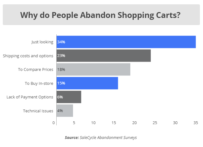
This happens more often than you’d think. In 2018, the overall cart abandonment rate in the retail industry was 74.58% – and 79.17% across all industries.
Think of all the money businesses leave on the table everyday.
This is where abandoned cart (or cart rescue) emails come into play. A well-crafted, timely message can be just what your customers need to convince them to make the final purchase.
The following are 7 variations of this practice done properly that can serve as models for your own approaches.
1. Still Deciding?
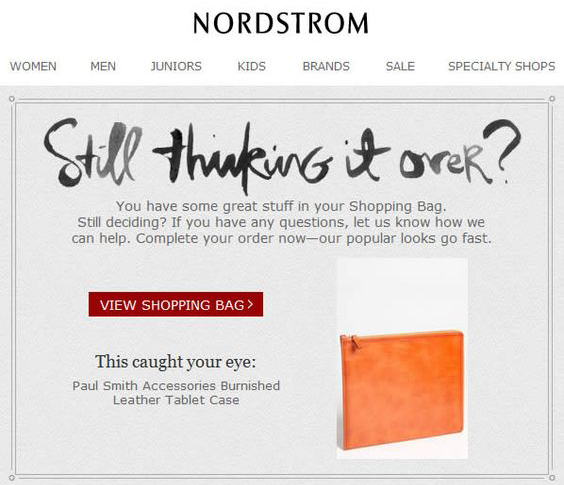
Right off the bat, this template by Nordstrom suggests that you might still be undecided about purchasing an item. In that case, they offer to answer any questions you may have, and include a call-to-action to make your order not later – but right away.
2. Special Discount
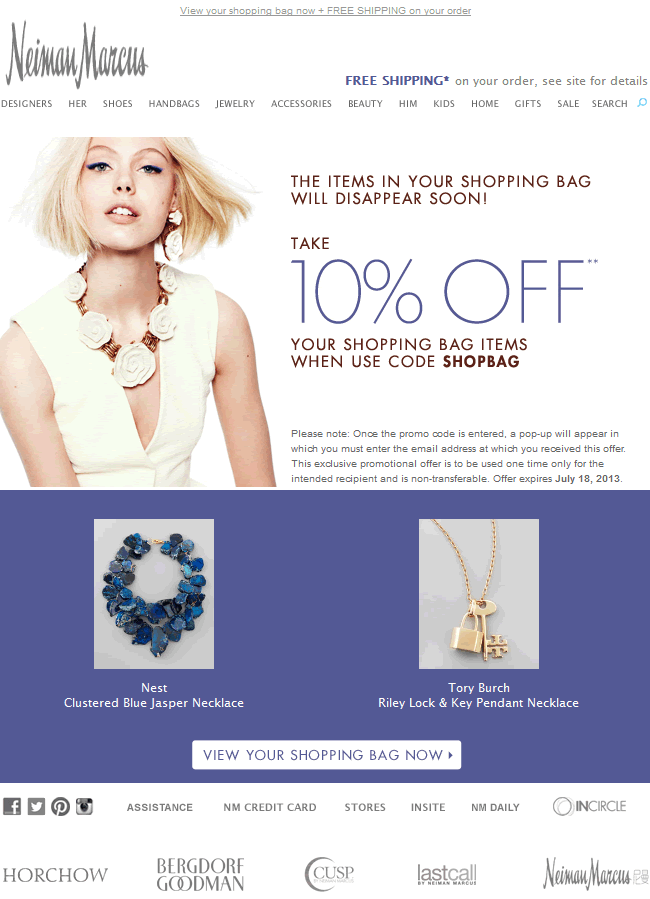
This discount offer by Neiman Marcus adds a little extra incentive for shoppers to complete their purchase. Even if the price didn’t necessarily play a factor in their cart abandonment, a markdown in price greatly increase the odds of purchase.
3. Time-Sensitive Offers
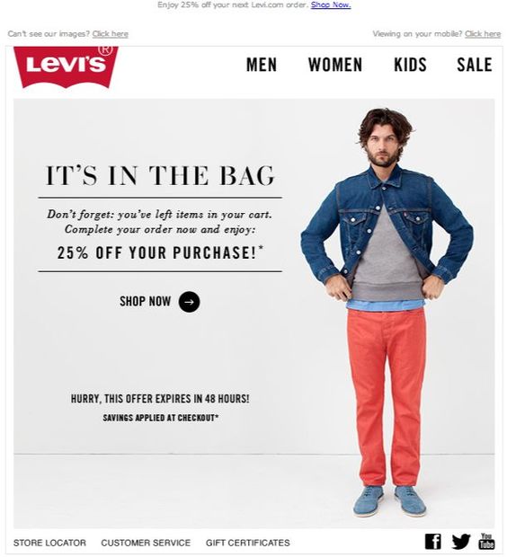
This email by Levi\’s
accomplishes two things that are likely to reel shoppers in and entice them to buy. Not only do they offer a discount on the original items like the previous example, they only give a limited amount of time for shoppers to utilize it.
4. Other Recommendations (Cross-Selling)
This template accomplishes two things. First, if the shopper still meant to purchase their original items, they obviously still have that option.
However, perhaps they already bought the same product or a similar type elsewhere. In that case, it certainly makes sense to include similar product recommendations – also known as cross-selling.
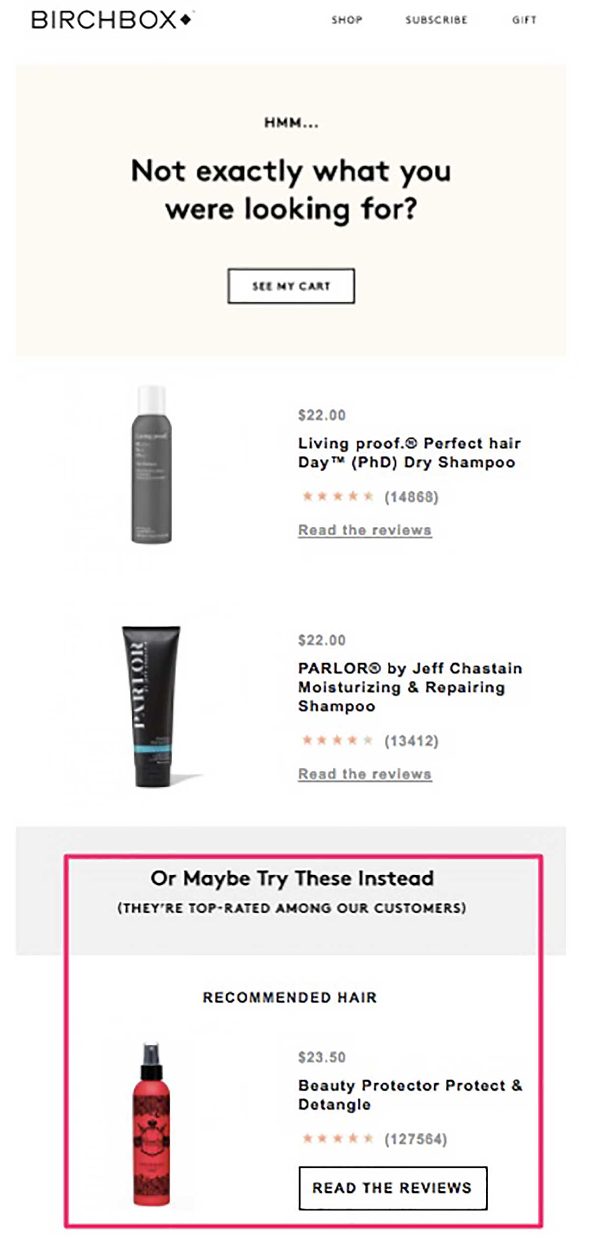
Birchbox accomplishes this by suggesting an alternative hair product other than shampoo. Perhaps the shopper will purchase this instead – or even better – add it to the other items already in the cart.
Also note that the message shows high product ratings next to each item, and indicates that the suggested item top-rated among customers. Most shoppers take ratings into high consideration when making purchases, so be sure to show off if other customers were satisfied with their own purchases.
5. Almost Gone
On top of a cute, appealing image, this email notifies shoppers that if they do not purchase soon, their items will sell out of stock.
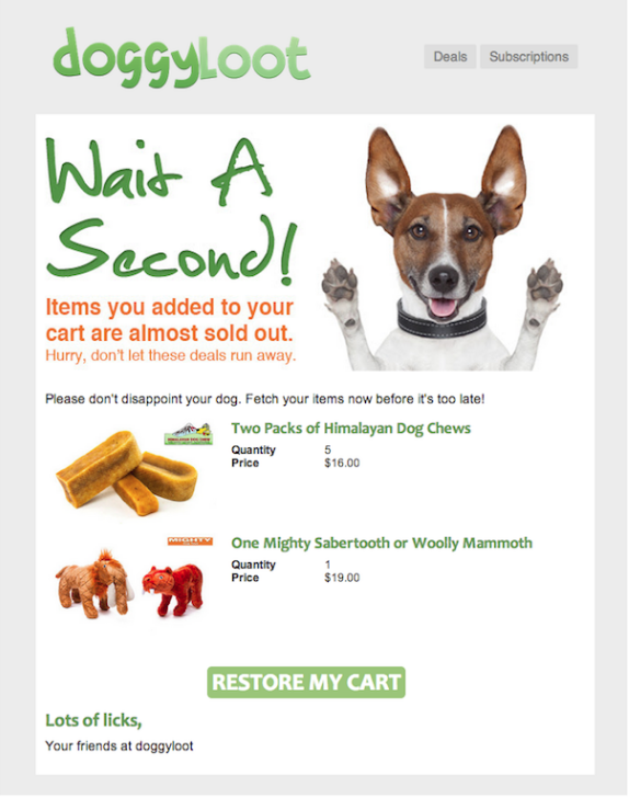
This also lets shoppers know that their items are in high demand, and that they would be missing out on something popular if they don’t go through with the transaction.
6. Humor/Personality
This message from Bazar gets straight to the point with a humorous message personifying the item that was left sad and lonely after the shopper walked away from it.
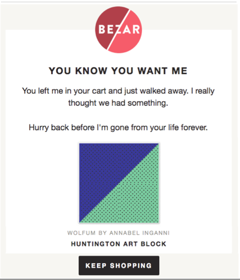
Also notice the subtle, nicely-placed call to action at the bottom. It is perfectly designed for mobile browsers – which is where most card abandonments take place to begin with.
7. Free Shipping/Returns
On top of a large image of the product to make it stand out to the reader and handwritten, personable font, this message from Warby Parker paints the purchase as particularly risk-free.
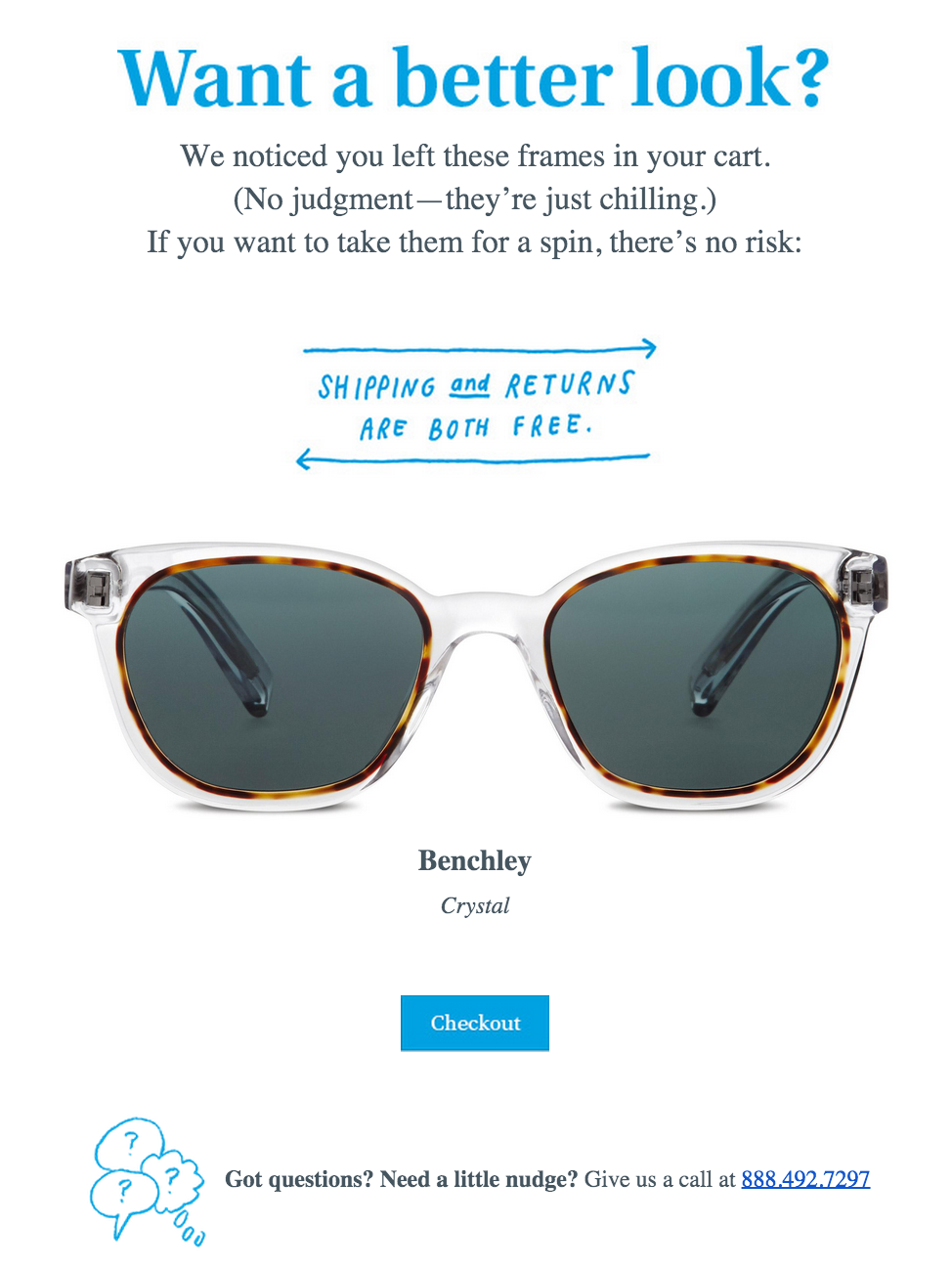
By offering free shipping and returns, shoppers are more inclined to give the product a try – particularly for an item like sunglasses. There is a reason why physical stores have mirrors and allow customers to try on their eyewear. Glasses of any kind are items that have to look and fit just right. This way, buyers have the ability to literally “try it out” and send it back to the store – or “put it back on the shelf” without any cost.
Conclusion
The above examples paint a clear picture of what successful cart emails should look and feel like. With automated marketing platforms like a PMA, it is easier than ever to not just design highest-quality messages that re-engage customers with your brand, but also send them at the best times and with the proper cadence.


